Blog
CALL FOR INTERNS April 10 2015
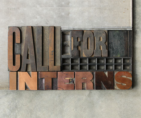
It's Hard to believe our spring semester is almost over! We have had a great time with Katherine, Victoria and Michael and would like to thank them for their hard work and dedication. They were an integral part of a very intense period of preparation for the National Stationery Show that we will be attending in May.
We are now accepting candidates for summer internships. This semester we are changing it up a bit and are looking for PRINTING, MARKETING and DESIGN interns.
Applicants, please email your resume to missy@firecrackerpress.com. (NO PHONE CALLS PLEASE) Knowledge of letterpress is not required.
HOT SUMMER IN THE CITY April 09 2015

This cute couple found a great way to make the best of a hot summer. Break out the fans & have a naked dance party! "SUMMER BREEZE" is our newest release from the "SOCIAL STUDIES" line of stationery. You can purchase "SUMMER BREEZE" online or at our Cherokee Street location.
PINK TILED BATHROOMS March 27 2015

New Release! "The Leonardo" illustrates what happens when people live together and get really, really comfortable with each other. This card is part of our new stationery line titled "Social Studies", where we explore the delights of cohabitation. "The Leonardo" is available online and will be available at our retail store on Cherokee Street this Saturday.
75% OFF SALE March 26 2015

We're all business about spring cleaning!
The last day of the sale is this Saturday from 11am to 5pm. Get posters starting at $5, stationery and greeting cards starting at $1.
Bunches of foodie cards, gig posters, home decor, business decor and seasonal items.
Click here for directions to our Cherokee Street location.
OH, HOW I PINE FOR YOU March 19 2015

Conversation over piping hot coffee in a knotty-pine-walled kitchen. That's the sentiment behind "Knotty Pine", the second release in our "Social Studies" stationery and lifestyle series. Someone's got to take care of your saggy skin forever, no matter what. These knots never break.
"Knotty Pine" can be purchased online, or at our Cherokee location starting Saturday 3/21/15.
THE SWEETEST "DUTCH OVEN" March 13 2015

Ahh....the joys of cohabitation.
Introducing "Social Studies", our new line of stationery that aims to explore the myriad of ways we share the grossest parts of being human with the ones we love the most. Today we are releasing the first card in the series, "Dutch Oven". This sweet little couple is resting on a bed made of three hand-carved woodblocks and letterpress printed on our mid-century Vandercook.
You can purchase "Dutch Oven" online, or stop by our retail location on Cherokee Street.
Nothing says love like a double dutch oven.
50% OFF SPRING CLEANING SALE March 06 2015

Take advantage of the beautiful weather Saturday and stroll down Cherokee to our shop for bargains starting at $1.
Select stationery, greeting cards and merchandise will be 50% off or more!
11AM - 5PM
EVERY SATURDAY IN MARCH
2838 Cherokee Street
See you there!
WE'VE SPIFFED UP THE WEBSITE February 11 2015

Well, spiffed up is an understatement - we chucked out all the old stuff and started fresh. We expect 2015 to be our biggest year yet and we all felt the website wasn't representing the direction of The Firecracker Press anymore. It's an agonizing process to revamp a site. We spoke to countless developers, all who brought great ideas and incredible talent to the table. We also looked at all of the major DIY e-commerce web design companies out there. In the end, after about 6 months of research, we decided to keep it in-house with a clean site that allows our products to be the stars.
Our goal was for the new site to provide our customers with an improved shopping experience. We also have added more flexibility for everyone on our team to be able to easily add new products, make site edits and add blog posts. We're pretty excited about the changes and hope you will be too! We welcome your feedback, so please send us an EMAIL with comments.
Be sure to sign up for our email NEWSLETTER to stay up to date on events, new products and sales. Also, keep checking the NEW products section. We just added a new LOVE card, perfect for Valentine's Day, a wedding greeting card, or just to let someone know you're thinking of them. Who doesn't love pretty mail?
HAMILTON WOOD TYPE - WAYZGOOSE 2014 November 11 2014
We’ve been traveling to Wisconsin to visit the Hamilton Wood Type and Printing Museum for about 4 years now. It’s a fascinating place, two hours from the closest major airport, in a small town along Lake Michigan. If you’re reading this we suggest planning your next vacation around a trip to Two Rivers, WI. Their collection and hospitality are well worth the effort, and our recent journey (to and from) has given us a moment to reflect on our time there. Here are two accounts, unedited, from first-time attendees of the annual Hamilton Wood Type Wayzgoose (aka printer’s party)…
1. From Briana Kagy – Printmaker
In our shop, we speak often about the limited number of people in the world who can speak about letterpress, printing, and design with the same passion that we feel for them. The Wayzgoose at the Hamilton Wood Type and Printing Museum provides an opportunity for that limited group to come together and nerd out over all the things that get our blood pumping, to share tips, experiences, and stories. As its eclectic name suggests, the HWT Wayzgoose is, in a word, surreal. The museum itself is like a playground for printers and designers, filled with pieces of printing history and providing studio space for today’s printers. Adding nearly two hundred printing enthusiasts to that equation is guaranteeing a very unique weekend. It is no wonder that people travel from all over the world to this small town in Wisconsin for this conference each year.
Because of our enthusiasm about the HWT Wayzgoose, our own eight-hour drive to Two Rivers, WI, could not have seemed any easier. The buzzing excitement in our little rental car matched the feeling in the museum when we finally arrived in the early evening on Friday. Entering the museum, we were met warmly by museum volunteers, staff, old friends, and treated to smoked salmon, freshly grilled paninis, tomato soup, and an assortment of other goodies. Later that night, Charles S. Anderson spoke to the group about his vast collection of imagery, formed over the last several decades, and how he has taken steps to modernize vintage illustrations and make them more relevant to present day designers. He was certainly not alone in his two wishes to mix the old and the new and to share his imagery with other designers. After the programming for the evening had ended, we got a chance to explore the museum for a short while, and then the reunion moved to a couple of nearby bars.
After a breakfast of donuts, fruit, and coffee, Saturday was packed with breakout groups ranging from type specimens to papermaking to public art. Choosing which speakers to attend was the most difficult part of the weekend. I decided to see David Wolske, Greg Walters, Bryce McCloud, and Clint Harvey. David Wolskedescribed the techniques he has been using of late in his own work. Greg Walters brought his exquisite collection of European type specimen books, generously allowing us to look through them and witness first hand the painstaking, sometimes hand-painted, detail. Bryce McCloud gave an inspiring presentation about his work in Nashville, emphasizing why he feels public art is important and how he reaches out to his own community and beyond. Clint Harvey, all the way from Brisbane, Australia, spoke about the challenges he has worked through to get The Bacon Factory going in a country that is almost exclusively fascinated with the newest technologies.
Saturday evening began with a couple of covert woodtype sales at the hotel, complete with a bathtub cooler filled with Wisconsin beers, wine, and cheese curds. It was followed by a hearty dinner reminiscent of Thanksgiving, a talk by some of the men behind Tipoteca Italiana, type trivia, and cosmic bowling, but as this group can only get together once or twice a year, the night hardly ended there. We went on to try the “cherry bounce” at the Waverly, witness a bar fight, cheer on our peers at karaoke, and stay up into the early hours of the morning either catching up or getting to know one another.
Sunday went quickly, beginning with donuts once again, a presentation from Greg Walters about watermarks, and an incredible woodtype giveaway. Aside from everything else, the spirit of the print exchange that filled the last two hours of the 2014 HWT Wayzgoose pretty well describes the vibe of the entire weekend. I am certainly biased, but I find that printers are fascinating people, and the generosity and comraderie of the group as a whole is striking. The print exchange felt like a potluck dinner at a family reunion, with everyone giving freely of their tips, techniques, and prints like a distant aunt might offer up her coveted recipe along with a bowl of her infamous chili. The love of design, type, and printing had united veteran Wazgeese and fresh faces alike, and as the new and old friends hugged goodbye, it was clear that the relationships formed and nurtured there go beyond just one brief weekend per year.
2. From Christina Casnellie – Designer
I feel like the luckiest person to have experienced this weekend. It had all the ingredients of history-making: a road trip, some super stars, typographic eye-candy, type geekery, new friends, some booze, donuts, cheese snacks and bowling. Beer was drank from bathtubs and type was dealt in a frenzy from hotel rooms. People were excited, and flowed out into the hotel corridors. Probably it was legal but maybe it wasn´t. I like not to be sure. The local bar has a crowd that reminds me of who you might find in a bar in Krakow on a Sunday to Monday late shift, not pretty. They have something they call the cherry bounce for a mere 79 cts. It is exciting stuff, and I choose to believe that it is a local specialty only available in two rivers. And cheese! That squeaks when fresh and can be single or double fried. Also milk was served at dinner.
I had read about two rivers before knowing I would ever have the chance to come to the wayzgoose, back to the days when the founder had jumped logs down the river and later discovered that cutting type out of holly wood worked very well. It seemed like a dreamy time that was sepia toned. Maybe what I would choose if time travel options were presented to me. Present day Hamilton Wood Type & Printing Museum has piles of cuts, and type, and machines. The museum is so great that I had to hold onto the wall as a turned the first corner as I came in. It is the first time I have seen a pantograph, which is nothing less than object imbued with magic powers. Hamilton is a Mecca.
Charles S Anderson was one of the super stars and it was pretty cool to see him walk us through his life endeavors. Jim Sherraden left me wanting to run to Nashville to find out if it is a place where people always have a musical instrument on hand and might break out into song and jam away without any warning. The type specimen books made me red cheeked and eager, realizing that all the time this weekend would not get me half way through devouring them. And I needed to see it all. Wolske was cerebral and surgical. There was gravitas in his work and mind set that impressed all. Bryce has great work that is also kind and playful. And pants that are waterproof. And I wouldn’t have thought of making a mural with paint cans in a million years. Also, If anyone knows someone who works with leather and could make him some buckskin pants send the contact, we’ll get it to him. Clint made it quite clear that Brisbane is one of the best places in the world to live. Maybe the best. He is full of dedication and passion that is inspiring. I only wonder what all the slang he had printed really meant. Did we gringo’s capice the aussies lingo at the print showdown?
The watermarks showed on Sunday were kind of like watching the circus. They do tricks while making it appear simple you know all along that you shouldn’t’t try it at home and you can’t help but letting out a verbal ah! of surprise when they finish the trick. The door prize give-away is still had for me to believe, in equal measure for the almost insane generosity as well as the amazing fashion sense of Dave Peat. The swap seems like its there to drain the end of the battery. So much good work was out on show. I know its good stuff when it gives me a stomach ache, its the stomach ache of “I wish I had done of that”, awe with a touch of jealousy. But it also inspired me like a kick in the pants to get back to work and keep trying to make better stuff.
All through this, the Hamilton crew proved themselves at every occasion to be some of the genuinely friendliest people I have ever met. It was nothing less than amazing. Thank you so much Hamiltonians. I hope I can make the pilgrimage and get whoop ass inspired for many years to come. And when I die I hope heaven is something like Hamilton.
FIRECRACKER IS HIRING: DESIGN POSITION AVAILABLE October 20 2014

**UPDATE 10/2014 - POSITION FILLED**
The Firecracker Press is hiring!
Position: Graphic Designer
We’re looking for someone with a keen sense for new ideas.
Got a strong knowledge of type and letterforms? Love paper and ink and want to develop tomorrow’s trends? Want to work in a letterpress studio that fosters sharp skills, values the hand-made, and works with clients that have high standards?
No prior letterpress experience needed, but design-for-print skills are a must!
Good communication skills are also a must! You’ll be meeting directly with clients… independently and collaboratively.
Know anything about web design? That’s great, but not crucial.
This is a full-time position with salary dependent on experience.
Send your résumé and digital samples to: Missy@FirecrackerPress.com
SGCI 2014 WRAP-UP >> SAN FRANCISCO April 15 2014

The Firecracker Press was happy to be a part of the 2014 Southern Graphics International Conference in San Francisco, California. SGCI is the nation’s largest printmaking conference that allows professional print artists, printmaking students, galleries, collections and more to gather in a display of the past year’s highlights in printmaking. Each conference is led by one of the host city’s local universities and allows for each year to have a special feeling all its own and features the flavor and attitudes of that city. San Francisco’s 2014 conference “Spanning Bridges” was a view into the rich, abundance of print in that city as well as the entire Bay area. The title also served as a nod to this conference being the first on the west coast.
Firecracker took part in this year’s conference by bringing a taste of the mid-west to the bay. With a table in the Publisher’s Fair at the conference hotel, and through various shop vistas, we meant to extend our exposure to the west coast area and bring back a bit of inspiration from a dense, visually powerful city.
THURSDAY
We left early on a Thursday from Lambert International Airport, having a lay over in Dallas and then a flight to the Bay area. After getting our bearings a bit, we found ourselves on the BART (Bay Area Rapid Transit) and made our way downtown to the financial district. We checked into the conference at the downtown Hyatt Regency and began to spread our fondness for midwest Letterpress Printing.
While fellow St. Louis contingencies from Pie Crust and Paul Art Space manned their tables and proceeded to explore the hotel a bit, I found a cab driver who began to shuttle me at high speeds towards the Presidio – the luscious park of green wandering hills at the North of the peninsula. I was aiming to get to a tour at the fantastic M&H Typefoundry and the adjoining Arion Press. Sadly, the cab driver knew only how to get close to our destination and after some frantic maneuvering, he started to drop me off at the Walt Disney museum. Time was running out to get to the tour, so I had to tell direct him how to get to a place I had never been to before using a google map print out from the hotel Concierge. He dropped me off just in time, (mostly)!
Arion Press and M&H was a fantastic collection of rare hand-printed books, art pieces and well preserved presses. Coming in the door, you’re confronted by a massive cast-iron Columbian Hand Press: a reminder that you are about to see history alive. The introduction was conducted by Arion Press’ Diane Ketcham who explained the beginnings of their press and how they continue to produce fresh lead type and wonderfully printed rare books. Diane’s husband, Andrew Hoyem, is the founder of the Arion Press who learned his trade from the famous Grabhorn brothers of San Francisco printing fame.
She introduced us to the display gallery, gave us a brief history recap and then handed us off to Mark, a second year apprentice who led us on the tour proper. He began by taking us through the press room and into the Foundry. The business of the day was fixing a monotype caster and continuing to produce type on another. The monotype casters were originally powered by a long punch-card strip of paper, which would tell the caster which letters to produce. We saw that machine separately. Today, however, they have a MacBook hooked up to a machine that produces controlled blasts of air and it talks with the typecaster to produce the lead letters.
We next travelled to the type storage corridor, and the first of several halls full of lead type. Its estimated that their collection of type may be the largest in the United States. Continuing back to the press room, Mark showed us yet more type, a collection of Vandercooks for proofing, a pair of large cylinder presses and the Thompson Laureate platen press which was humming along with Andrew Hoyem at the lever along with a press assistant. They were printing a spread from Walt Whitman’s “Leaves of Grass” on hand made paper. The tour continued to the bindery where we were introduced to their sewing frames, book stitching machines, horse hide glues, book-spine clamps, leather supplies and work tables. Another full hallway of type led to the paper storage areas and then back up to Arion Press to see the galleries.
After the tour concluded, Diane and Andrew were most gracious enough to drive me a ways back into the city proper, near the Union Square Neighborhood. After trying to find a few more letterpress shops in the area, I picked up a sandwich on the run and proceeded back to the Hyatt. The student portfolio session, a room packed with hundreds of student printmakers and their work, was in full swing Thursday night. So not only did I get to view a bit of what future printmakers hold in store, I was also able to talk to conference goers about the Midwest Letterpress Trail. The evening concluded with a few friends and some drinks at a downtown bar called Terminus. A cab ride got us home to the Mission District to end the first day.
FRIDAY
Friday morning came early! Myself and the other St. Louisans were staying in the Mission District of San Francisco. We headed out from home base and picked up a pastry and coffee, which we happily ate on the way to the BART station. The morning allowed for some more time at our booth at the Publisher’s Fair, but the afternoon would have more fun in store – we would be making our way to the San Francisco center for the Book, a fantastic institution in letterpress printing and bookbinding.
When we arrived, I was amazed at the size of the studios and the amount of printing equipment they had, a wonderful collection. A shiny row of six Vandercooks stood in the middle of the space and an area in the back of the print studio held a trio of platen presses and type. They also have an expansive gallery – we were able to see a mail art show as well as some pieces from a group of contemporary letterpress artists. The SF Center for the Book also houses a large bindery studio for traditional book-binding. In the back of the Center, was a gallery of Steam-roller prints on display.
After a tasty lunch at Market and Rye, we hopped on the nearest BART station and proceeded to the East Bay to find the Compound Gallery, one of the highlights of the trip! The place was packed, busy and visually potent, with plenty of printing demonstrations. The Compound has a large back warehouse-style space with a central print area filled with letterpress equipment and type. Surrounding that print space are artist studios of various types. I was able to chat with the founders, Matt and Lena Reynoso, who filled me in on the type of work they seek and the community they try to achieve through open studio classes, art shows and artist residencies. They were very friendly and talkative, despite being so busy, and enjoyed talking about Firecracker’s future as well. In the main gallery was work by UC Santa Cruz professors and a show featuring woodcuts by prison inmates. And there was a flashback to St. Louis’ own 2011 version of the SGCI conference, as we got a chance to see a printable tortilla exhibit. I happily scarfed down a cheese quesadilla, custom printed for me. There were also lazer-cut woodblock printing, large-scale hand-printing, and poster printing with Bridget Henry of UC Santa Cruz, who had also done a large woodcut mural wheat-pasted on the building.
A trip back on the BART took us back to Downtown SF and our booth. Dinner could not have come too soon, and we headed to a brewery and tapas place called the Thirsty Bear for beer and burgers. A taxi took us back to the Mission, where we arrived safe and went to bed.
SATURDAY
Saturday was going to be the big day for our booth (and an early start at that). A coffee and a croissant from Joey&Pattie’s Italian bakery made the morning a little easier. It rained heavily on Saturday, so we were pretty soaked by the time we got to the booth. Throughout the day I was able to chat with a lot of print-lovers, the majority of whom were first time viewers of the Firecracker Press. I met with folks from Painted Tongue Studios in Oakland, a Portland press cooperative, the Graphic Arts Workshop in SF and more. I chatted for a while with an instructor form Southern Florida about an internship exchange program and had a good visit with the fellows from Printeresting.com about the differences in San Francisco’s conference to the Saint Louis one. I chatted with Laura Drapac at University of North Texas outside of Dallas about a visiting artist opportunity. I also chatted with Felicia Rice from Santa Cruz about her letterpress/book arts projects and their hopeful inclusion on the future West Coast Letterpress Trail. David Jones, of Anchor Graphics in Chicago, and a perpetual coordinator of SGC conferences, spoke of his fondness of the city and the differences in planning this conference for various cities.
The booth closed at 5 and the STL group made our way back to Mission to rest a bit and then set out for the Mission Art Walk. A great feature of the Conference is it’s art walks, and they are a great way to get the flavor of the city and the people that make it unique. Places of note included Asterisk Magazine’s gallery, the Adobe bookstore and gallery, and then the XXL PRINT exhibit – the annual Cannonball Press show with friends at Mullowney Printing. The night concluded with an authentic Mexican meal of carnets at a taqueria. My night ended a bit early as I had to be up for a 6am flight.
San Francisco was packed with printing (particularly letterpress). The city itself was densely crammed with houses, people and transportation. In comparison with previous conferences and previous cities, I would say San Francisco provided an great amount of activities to see and places to visit, though the size and scope of the city made it hard to travel easily or quickly. We definitely had to pick which things we needed to see. But when you’re surrounded by warm breezes in 60 degree weather, any choice you make is probably going to be okay. Printmaking is alive and well in San Francisco!
OUR UNBELIEVABLE JOURNEY... ONE YEAR LATER (PLUS) February 27 2014

In the later part of 2012 we started exploring St. Louis for a second location for The Firecracker Press. As our home-base on Cherokee Street started stacking up with posters and presses we began the search for more space. Something flexible. We needed heavy-duty floors, loading dock access, and 3-phase power. We wanted another storefront space, a supportive neighborhood, and room to grow. St. Louis is long on available property but finding the right fit surprised us. We ended up in a place for which we hadn’t planned, but couldn’t be more pleased.
At the urging of neighborhood supporters (both physical and fiscal) we took a tour of the old 14th Street Mall, now called Crown Square, in Old North. We’d looked there on a cold Winter day 10 years ago and were surprised to see the renovation project that’d taken place, more recently, in 2007-08. The folks from Old North St. Louis Restoration Group and Equifax showed us a nearly 8000 square foot space. It was big! It had everything we needed and it hadn’t been occupied since renovation. We would need to invent a new way of thinking about the future of The Firecracker Press. We set out to do that very thing.
With an interest in the space, and meetings with various parties a picture of the future started to develop. A non-profit organization would occupy a portion of the space, The Firecracker Press would share part of the footprint, and a venue for events would hold the whole thing together. An “arts center” where kids and adults could explore ideas, and a humming printshop would make a winning combination. Funding from Equifax was secured, the neighborhood loved the idea, and the property developers (Rise) were willing to work with us to build-out the space. More than a year later we’re almost ready to open the doors!
On the non-profit organization front we’ve been developing programing for community outreach, educational opportunities, and promoting printing history through useful preservation. We’ll have open studio hours for do-it-yourselfers, and welcome a full calendar of events. We’ll also have a retail shop and be teaching practical entrepreneurial skills.
On the Firecracker Press front we’ve been collecting lead/woodtype, and an army of antique presses that will make St. Louis the center of the letterpress map. We’ve acquired gear from several local printshops, typecasting equipment, and tools that connect the dots through printing history. You’ll be able to visit while we’re printing, take tours of the space, and learn about the printmaking timeline.
The St. Louis community has supported The Firecracker Press for over 12 years. With our already established location on Cherokee Street, a newly expanded space in Old North, and a non-profit organization we are very excited about reaching the community even more. We’re hosting a fundraising party on April 4th from 6-10pm to get the non-profit organization off the ground. Tickets can be purchasedhere. If you can’t attend the party but still want to support our cause that can be done here.
We’ve not come this far alone. We’ll need your support to move ahead!
BARNARD STAMP COMPANY COLLECTION June 20 2013

Eleven years ago we opened The Firecracker Press in a small studio in downtown St. Louis. We knew some of the history that surrounded us… old buildings, a legacy of printers along Washington Avenue, a naive knowledge of manufacturing. Occasionally we’d drive down the street to get a rubber stamp made at Barnard Stamp Co. where we could see composing stands filled with type behind the counter. We had no idea that they were the oldest rubber stamp company West of the Mississippi, or that their history stretched back to 1860. Eventually we’d get invited behind the counter at Barnard Stamp with an offer to let us rifle through their collection. Being nerds we were thrilled to see behind the scenes, but it would be many years before we would play an active roll in their company’s history.
Earlier this week we acquired the remainder of the lead-type, cabinetry, and tools from Barnard Stamp Co. Many of the typefaces tell the story of the founding days of St. Louis, and looking through the cuts and tools is like peeling back time. Some of the typecases and cabinetry are homemade, others were professionally manufactured, but all were painted battleship grey after an ex-employee, a Navy man, returned home from the war. We’ll begin cleaning the collection and cataloging everything over the remainder of the year. Everything will be put to good use and find its way onto new posters, books, business cards, and stationery… these tools were made for work!
If you’re interested in seeing the collection or finding out more information give us a call at (314)776-7271. You can get more info about Barnard Stamp Co. here, or visit their shop and have a custom stamp made anytime.
FUN FACTS:
- Barnard Stamp Company, started in 1860, is still family owned today
- The collection we acquired weighs about two tons and fit neatly into a 16’ moving truck, side to side, top to bottom
EXPANSION PLANS - NEW STUDIO/RETAIL/VENUE May 16 2013

The Firecracker Press Announces Expansion Plans - New Studio!
FOR IMMEDIATE RELEASE
The Firecracker Press is Opening a Second Location in Crown Square, St. Louis.
St. Louis, MO - The Firecracker Press is excited to announce, in addition to its location at 2838 Cherokee Street, the expansion of a second location at 2612 North 14th Street, in Crown Square. The expansion will take place over the Summer of 2013 with a Grand Opening to be announced later this year.
Founded in St. Louis in 2002, The Firecracker Press has become a cultural institution for printmaking. With a gang of antique printing presses (some dating back to the 1800s), a rich collection of St. Louis printing history, and a talented group of designers and printers, The Firecracker Press has made its mark regionally and nationally. Handmade, letterpress posters for music and art shows, custom business cards, stationery, wedding invitations, and books are just a few of the things that The Firecracker Press crafts. Using printing presses that are found and restored, The Firecracker Press prints from hand-set wood/lead type and uses hand-carved woodblocks to create imagery that's rooted in history yet freshly modern. Its Southside, Cherokee Street location will remain while The Firecracker Press plans to expand a rotating list of events, classes and demonstrations at the new Crown Square location.
THE FUTURE: The new space, nearly 8000 sq. ft., will host a large collection of printing presses and tools, a retail storefront with a variety of posters and design-related home-goods, and a 100 person capacity venue for music, readings, and events. The Firecracker Press will continue to offer the same high quality, unique, independently minded services that have made them well-known. The expansion will also bring the opportunity to collaborate with other organizations including Old North Restoration Group and its affiliates, and with Studio StL, which will be sharing a portion of the space for its non-profit, children's writing programs. The publishing arm of The Firecracker Press dovetails in exciting ways with the mission of Studio StL. An arts center for writers, thinkers, and makers will grow where The Firecracker Press and Studio StL overlap, with more to come.
Stay tuned for updates and information about the build-out of the new space, the date for the Grand Opening and other kick-off events at...
WEB - www.FirecrackerPress.com
FB - https://www.facebook.com/firecrackerpress
INSTAGRAM - @firecrackerpress
HISTORY:
2002 - The Firecracker Press was founded in a small, 500 sq. ft. studio on Washington Avenue. The operation began with one press, some type, and a few woodcut tools.
2003 - The studio moved to the Southside and into a space above the Chippewa Viaduct. Over the years The Firecracker Press grew into the space and eventually inhabited half the building. Employees were hired, working with part-time artists became crucial to meet expansion needs, and an internship program was established to help train young printmakers.
2007 - In order to meet the growing demand for its posters, cards, and retail products, The Firecracker Press purchased and rehabbed its current location on Cherokee Street. The studio/retail store quickly became a staple in this budding shopping district.
2013 - The Firecracker Press announces expansion plans in Crown Square while maintaining its retail location on Cherokee Street.
For more information about expansion plans for The Firecracker Press, details about the collaboration between The Firecracker Press and Studio StL, the venue, printing history, and/or how The Firecracker Press makes posters, cards, stationery and more, contact Eric Woods (eric@firecrackerpress.com - 314-776-7271) or visit www.FirecrackerPress.com
WOODTYPE - CON P. CURRAN PRINTING COMPANY October 13 2012
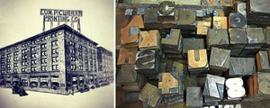
A few weeks ago we sniffed out a bunch of woodtype on Craigslist. When seasonal allergies aren't plaguing our sinuses we've got a pretty good nose for finding old stuff, and this batch came along at the right time. We feel pretty lucky to have stumbled upon this listing as we'd find out it has historic significance to St. Louis industry, especially the printing industry.
With a few email exchanges we realized we were talking to one of the great grandson's (Jack Curran) of the late Con P. Curran Printing Company. Over the years, finding ourselves in a conversation or two with old-timer printers, that name has come up more than once. Con P. Curran printed for the railroad, and airline industries. They were founded in 1893, were located in the vicinity of the cities great typefoundries and other printers, and headquartered on land that is now home of the Gateway Arch. They had offices in New York, Chicago, and Dallas among other cities. They eventually folded the company around 1989, a company with a legacy of over 100 years.
Jack went on to be successful in photography and advertising but never wanted to go into the family business. "I was the oldest son and pretty much expected to do so. My father sat me down and asked, but I declined... As to how it influenced me... I always felt the pull of printing as a craft. The issue for me at the time was the company was presented to me as a business and not a craft. I wanted to explore more creative ventures."
We're honored to be the keepers of such beautiful type styles and happy to know the posters and prints we make will continue this line of St. Louis history. To see the collection with your own eyes, stop by the studio and ask politely. If you're good lookin' we might let you peek behind the scenes.
FUN FACTS:
- You can still drive down the Avenue in Kirkwood that's named for the Con P. Curran family, Curran Ave.
- In his prime, Con P. Curran was an honorary sheriff of St. Louis.
POSTER GIVE-AWAY. OFFICIAL RULES! August 13 2012

We're giving away these limited edition, letterpressed posters for the Missouri Department of Conservation all week (8-13 thru 8-17). At this point these posters are not being sold in stores. If you'd like to get one here's how...
1. Go to our Facebook page and find the "Daily Question". There'll be a new question each day.
2. Answer the question in the FB comments field.
3. Check back after 6PM. We'll announce one winner each day on FB.
4. Pick up your poster at The Firecracker Press or have it shipped.
Things to keep in mind...
1. Keep your answers short and sweet. Point awarded for being concise.
2. Keep it clean. We normally love a little dirt but we're looking for respectable answers.
3. No emailed answers please.
UPDATE: CONTEST IS OVER. TO PURCHASE POSTERS CLICK HERE.
Thanks for playing!
HIRING! June 27 2012
__ NO LONGER TAKING APPLICATIONS - THANKS FOR ALL THE SAMPLES AND RESUMES __
The Firecracker Press has an opening for an applicant that's detail oriented, likes to make things, is good with numbers, mechanically inclined, knows how to be nice to people, and can work efficiently in a fast-paced studio environment. We're looking for someone that's creative but knows how to balance a checkbook, works well without supervision but likes talking with people, has big ideas but can also read a ruler.
Responsibilities include:
- General presswork and day to day printing.
- Greet customers, answer questions, check-out.
- Shop maintenance and clean-up.
- Archiving/Scanning of existing products.
- Inventory/Barcoding of retail products.
- Assistance with design projects using Adobe Illustrator/Photoshop.
- Help coordinating events.
- Work in our retail shop on Saturdays.
This is a part time position, with pay based on experience.
Send a resume and digital portfolio samples to... eric@firecrackerpress.com
TENTH (10th) ANNIVERSARY PARTY - TEE! June 21 2012

A few months ago we started talking to the guys down at Stl-Style about printing a t-shirt for our Ten Year Anniversary Party. They're so cool they didn't even think twice about helping us out... so the crew at Firecracker started throwing around ideas.
After a few false starts an image started to emerge from a swirl of memories, experiences, and a cloud of dusty woodtype. You can see a map of our studio locations over the years (3 of them), a quote from our old robo-mascot, Versacor (he does all the work), and a warning from the Devil himself coming to collect his due (letterpress is known as the "Black Art" after all).
We've got men's and women's sizes on a soft, chocolate brown, pre-shrunk tee. Comes with 3-D glasses!
TENTH (10th) ANNIVERSARY PARTY - HATS! June 21 2012

A printer's hat is a traditional, box-shaped, folded paper hat, sometimes made from a newspaper, and worn by craft tradesmen such as printers. When looking back to our beginnings 10 years ago, and considering the history of the equipment we use everyday, we figured it'd be a good idea to resurrect the tradition. Our Ten Year Anniversary printer's hats are totally, over-achieverly, over-the-top and printed in red and blue, with a special anniversary pin affixed to the front. If you come to the party on June 23rd from 6-10pm you'll get one, and it'll serve as your ticket to have a chance to win a door prize. Not interested in the prize but want a hat anyway? Now you're talking our language.
TENTH (10th) ANNIVERSARY PARTY - POSTERS! June 14 2012

Ten years ago we started The Firecracker Press in a dirty old warehouse with no AC, a creepy freight elevator, and an even creepier landlord. Some say we made a deal with the devil back then, gambling that a bunch of outdated technology could make for a thriving business. If that's true, ten years later the devil might be coming back to collect his due! And just in case, we made some posters to help pay the debt.
Try this! Put on a pair of 3-D glasses, close one eye and you'll see your friendly, neighborhood printer. Try the other eye and the devil pops up. Yikes!
These will be available exclusively at our Tenth Anniversary Party on June 23rd from 6-10pm (with 3-D glasses). Get lucky and score one for FREE in our raffle or door prize!
TENTH (10th) ANNIVERSARY PARTY - GROWLERS! June 13 2012

While thinking about how to mark our 10th year two things immediately came to mind... our old friends at Schlafly Beer (they've been clients since 2002) and 3-D comics from childhood. Since our hometown brewers didn't think twice about helping us celebrate, we poured ourselves 64 fl.oz. of happy birthday!
Want a little printing history while you're enjoying 3 dimensions of freshly tapped Summer Lager? The back of the growler explains why letterpress printing is historically known as "The Black Art," why we're not afraid of getting dirty, and how much we're looking forward to the next ten years.
Stop by The Firecracker Press on June 23rd (6-10PM) to help us celebrate and get a chance at a FREE growler w/3-D glasses. We're making t-shirts and posters and plenty of other ways to say "thank you for your support" so don't miss out! All other merchandise will be 10% off... oh! and Rob Levy, from KDHX will be spinning new wave records!
BOOK RELEASE PARTY FOR SERMONS AND LECTURES February 22 2012

Reading/Release Party - The Firecracker Press - Friday, March 9th at 7:00pm - FREE!
For the last year or so we've been talking about designing and printing a book of poems for Matt Hart. He had a reading at Firecracker last year, along with Nate Pritts, and delivered a hell of a show... frighteningly good. Outside of that reading we'd been talking with Typecast Publishing about how a book for Matt might take shape. Last Fall we finally started putting our money where our mouths were. Matt and Typecast decided they wanted a boxed set, with multiple books, and a CD by one of Matt's bands called Travel.
The info we gathered, from personal interaction, from Typecast, and from the image that surrounds Matt Hart, is that he's a tireless worker, a punk-rock performer, a father, and an unsettled soul. Those ingredients made a great platform to develop his new book, _Sermons and Lectures Both Blank and Relentless_. It's a combo of your favorite melt-your-face basement show, Sunday morning fire-and-brimstone, and string-of-pearls poetry all in one.
Matt will be reading at The Firecracker Press on Friday, March 9th at 7:00pm - FREE! You say you're not into poetry readings? We say shut the fuck up and get down here.


VALENTINE'S DAY - MAD-LIBS STYLE February 02 2012

On Saturday, Feb. 11th from 11am - 5pm we'll be making custom Valentine cards... mad-libs style. That's right you fill in the blanks with nouns, verbs, nicknames, etc. and we will print 'em up in 30 minutes or less. This year the cards are HUGE so they make a big impression as a card or a poster. And we'll customize a standard envelope for you at no extra charge. Quantities are very limited and due to the popularity of the event we suggest you come early.
Here's what we'll need from you...
1. Your Loved One's Nickname
2. Verb
3. Body Part
4. Another Body Part
5. Your Nickname
We've got plenty of other fine gifts to match your new card. Stop by on Saturday, Feb. 11th and be part of the fun. Happy Valentines Day everyone!